An update from me!
- Thread starter gosh
- Start date

You are using an out of date browser. It may not display this or other websites correctly.
You should upgrade or use an alternative browser.
You should upgrade or use an alternative browser.
- Jul 30, 2003
- 66
- 0
- 82
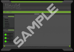
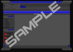
Windowlicker said:the first one is very nice, very xboxy, the second one, I don't like the fact it's all blue then there are red dots, and maybe you could use less vibrant colours...
Them red dots are just a button and its an animated gif anyway so it does change

Sil3nced.Mir2
Guest
Sil3nced.Mir2
Guest
More colour on that would be nice. I see the little icons.. more of them going across would look sw33t.