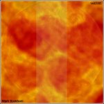
On the first, it looks nice although if you were really trying to gain the "sun" effect, then you should cut down on the orange and try make it more yellow, but it looks good ATM. just not like a sun :P.
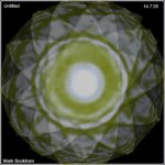
The second, well the circle in the middle is too blurry IMO. and also it should be synimetrical (however you spell that).