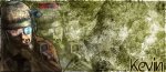
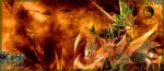
First Ever Mae Siggy

Mu online season 21 - grand opening

hellcaster

Golden Oldie
Golden Oldie
Mar 24, 2005
903
0
103
Heya, sorry for double post, heres another one
 

Attachments

  • BlueAby.jpg
    BlueAby.jpg
    110 KB · Views: 39

czeldabolg

LOMCN VIP
VIP
Sep 12, 2005
2,376
32
175
Staffordshire, UK
My my, much better matey, i'm impressed, although the 1&2nd recent ones are nice the third im not to fond of, think its just the render, hehe.

8/10 1st
9/10 2nd
5/10 3rd
= 22/30, little maths fer you haha anyway, yeah keep it up ^^
 

TxGraphicz

LOMCN Veteran
Veteran
Loyal Member
Nov 12, 2006
388
4
45
Your learning the wave of signatures... Ok now you've worked out how to brush in a grudge style... Think of some ideas and use them or otherwise there all going to look boring and similar, and actually try add some text to your pieces... keep the font colour simple for instance dont have a soft blue background and slap a luminous green onto it... use another soft blue or just use a white or black... post #20 is probally the best imo as the colours suit the render better... But the font on that is tiny...

GL hope any of the stuff helps..

Tx
 

hellcaster

Golden Oldie
Golden Oldie
Mar 24, 2005
903
0
103
My my, much better matey, i'm impressed, although the 1&2nd recent ones are nice the third im not to fond of, think its just the render, hehe.

8/10 1st
9/10 2nd
5/10 3rd
= 22/30, little maths fer you haha anyway, yeah keep it up ^^

Your learning the wave of signatures... Ok now you've worked out how to brush in a grudge style... Think of some ideas and use them or otherwise there all going to look boring and similar, and actually try add some text to your pieces... keep the font colour simple for instance dont have a soft blue background and slap a luminous green onto it... use another soft blue or just use a white or black... post #20 is probally the best imo as the colours suit the render better... But the font on that is tiny...

GL hope any of the stuff helps..

Tx


thanks for comments, and yeh im working on matching the colours :P thanks alot

/kev


p.s

maz, can you add me to msn please matey my new addy is [email protected] :P
 

hellcaster

Golden Oldie
Golden Oldie
Mar 24, 2005
903
0
103
Wow this is my latest one:O i followed a tut and this is what i got, im amazed....
 

Attachments

  • Wow,LOL!.jpg
    Wow,LOL!.jpg
    123.7 KB · Views: 29
  • Grunge.jpg
    Grunge.jpg
    76.2 KB · Views: 23
Last edited:

muffinpie

Golden Oldie
Golden Oldie
Jul 19, 2005
1,101
1
174
Those last two are ok but the second one could use a decent render and some small black text
 

hellcaster

Golden Oldie
Golden Oldie
Mar 24, 2005
903
0
103
Right, these are my latest lol ... post your comments please ;) (Y)
 

Attachments

  • DjSteve1.jpg
    DjSteve1.jpg
    54.6 KB · Views: 13
  • DjSteveSiggy.jpg
    DjSteveSiggy.jpg
    59.6 KB · Views: 14
  • SiggyForLEe.jpg
    SiggyForLEe.jpg
    55.7 KB · Views: 14

TxGraphicz

LOMCN Veteran
Veteran
Loyal Member
Nov 12, 2006
388
4
45
Last one of them 3 is the best, the other's images or backgrounds both seem distorted and not in proportion, but for all of them you need better a font. The font looks poo... The third one looks quite nice apart from that
 

hellcaster

Golden Oldie
Golden Oldie
Mar 24, 2005
903
0
103
Right okay, this is deffinatly my best one. Please post your comments of what you think =]
 

Attachments

  • GOW.jpg
    GOW.jpg
    67.7 KB · Views: 23

Neptune

Golden Oldie
Golden Oldie
Nov 19, 2003
1,473
9
175
Chester :P
Right okay, this is deffinatly my best one. Please post your comments of what you think =]

im not sure on that orange dot in the middle of the screen m8, and the font itsnt the best to go with the piccy. apart from that its a bit orange :P, the image is cut out well tho, think ur getting the hold of brush's
 

muffinpie

Golden Oldie
Golden Oldie
Jul 19, 2005
1,101
1
174
Got some really nice stuff going on here i think you should keep the original render colors though and make the siggy around the render because the each sig seems to just have one colour in it and it looks a bit plain
 

hellcaster

Golden Oldie
Golden Oldie
Mar 24, 2005
903
0
103
Got some really nice stuff going on here i think you should keep the original render colors though and make the siggy around the render because the each sig seems to just have one colour in it and it looks a bit plain

okie thanks, sometimes i use the render as the same colour as the siggy coz it looks better :P but ill try use the normal render colours. And what you mean work around the siggy? coz i usualy just change background to black then slap the brushes on then place the siggy then ill'd change the colour balance. ive allso made these siggys, the render is the same comments please =]


Attachments

  • ghostrecon2fc0.jpg
    ghostrecon2fc0.jpg
    55.5 KB · Views: 15
  • ghostreconsiggyxg3.jpg
    ghostreconsiggyxg3.jpg
    59.4 KB · Views: 11
Last edited:

muffinpie

Golden Oldie
Golden Oldie
Jul 19, 2005
1,101
1
174
I never use effects neptune all mine is brushes c4d's renders and some smudging
 

hellcaster

Golden Oldie
Golden Oldie
Mar 24, 2005
903
0
103
Does anyone know how to get them circle things out of the siggys? its the name of the maker of the render in the circle does anyone know how i can remove it please? thx :D

edit: this is my latest 1 hehe i blanded the render in 2 it coz the render colours just didnt go lol
 

Attachments

  • KevSiggy 2.jpg
    KevSiggy 2.jpg
    61.3 KB · Views: 11
Last edited: