New Graphic
- Thread starter Wond
- Start date
You are using an out of date browser. It may not display this or other websites correctly.
You should upgrade or use an alternative browser.
You should upgrade or use an alternative browser.

as im not a eyecandy kinda guy, if it looks gd enuuf and dont make me go EEWWWW its gd enuff but il try..
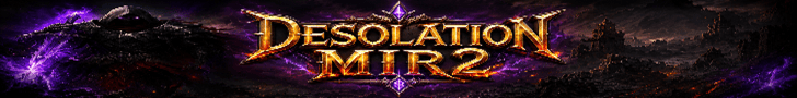
Gd use of glow tad plain of a background needs some more vavavoom but not bad gd effort
7/10
but hey what do i know im only a human
Gd use of glow tad plain of a background needs some more vavavoom but not bad gd effort
7/10
but hey what do i know im only a human
Add a border, and move the "Black Wall street" thing more into the image, if you know what i mean
>DMX< said:Lol, it is a bit too plain, unusual from your other work oO.
Yeah, just been messing about recently.
Spack said:Sig looks alright, you've just added the images - stroke + outer glow?
Yeah Spack, its basic I know but thats how i wanted to make it. If you ever notice any of the other signatures i use, there is always somthing going on in the background.
Just add scan lines to the background (really fade) to add texture; the logo/text I would say is slightly out of proportion and might look better away from the sig side. You could probably get away with making a sig with just that ")
Anyway nice job, I'd give it a 7/10, -2 for concept, -1 for plainness ^_^
Turin
Anyway nice job, I'd give it a 7/10, -2 for concept, -1 for plainness ^_^
Turin
- Mar 5, 2005
- 1,085
- 2
- 125