New graphic
- Thread starter Wond
- Start date

You are using an out of date browser. It may not display this or other websites correctly.
You should upgrade or use an alternative browser.
You should upgrade or use an alternative browser.
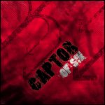
Zidio said:nice looking good whats it for may i ask 6/10 like the border rly stands out
Nothing in paticular.
Zidio said:so erm can i ask the point of this peice of work just to post on lomcn? hmm seems liek a waste of time but an ok peice i spose ^^ random
I'm not even going to bother telling you why, you should beable to work all of that out for yourself.
I like the background alot, the lighter red and darker red / blacky colour is realy nice, but i cant make out all of the writing
cLu3LeSs said:I like the background alot, the lighter red and darker red / blacky colour is realy nice, but i cant make out all of the writing
The only letter i think is hard to make out, infact you CAN'T make out is the N in 'SIN'. Can't be bothered to change the font at the mo though.
- Nov 13, 2003
- 3,967
- 27
- 274
i would have to agree, the N in SIN is hard to read, thought it said SIK when i have a quick look at it 1st time.
cLu3LeSs said:I thought it said SIX, so it says 'CAPTOR OF SIN' ?
Yeah
Edit - Changed font
Attachments
Last edited:
cLu3LeSs said:Can yu xplain what that means :S
Its the name of a song by Slayer
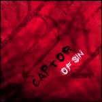
Hmm , i must agree, the 1st 1 still looks better, can you not use text on 1st piece and make it lighter... or make the stuff around it lighter?
Wond, if you're going to contradict everything anybody stays you're never going to make improvements in you're work. It definately needs work on the text, first one was best. But all in all, I plainly dont like much of it, the backround and text totally dismatch eachother and cant understand either(I know it seems stupid to not understand a backround etc. but its hard to explain, and you need something else apart from those vector arrows.
I'm not contradicting everything people say, infact im agreeing with them.
If that seems to you like i'm contradicting what people are saying then you seriously need to go speak to your optician. Only thing i commented on that i seen would be wrong to do would be putting a stroke around the text, which would basically make it look **** and i'm sure you would agree.
Myself said:The only letter i think is hard to make out, infact you CAN'T make out is the N in 'SIN'. Can't be bothered to change the font at the mo though.
KillMaster said:i would have to agree, the N in SIN is hard to read, thought it said SIK when i have a quick look at it 1st time.
Clueless said:I thought it said SIX, so it says 'CAPTOR OF SIN' ?
If that seems to you like i'm contradicting what people are saying then you seriously need to go speak to your optician. Only thing i commented on that i seen would be wrong to do would be putting a stroke around the text, which would basically make it look **** and i'm sure you would agree.
Last edited: