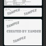
Security/Tech Template
- Thread starter Xander
- Start date

You are using an out of date browser. It may not display this or other websites correctly.
You should upgrade or use an alternative browser.
You should upgrade or use an alternative browser.
- Apr 15, 2003
- 1,302
- 1
- 175
ok firstly, you have duplicated the menu, i would leave it in the middle box.
The purpose of the top box is fine as a header, but make the words fill the box across in my opinion
Since you have currently got each box surrounded by a black border, apart from the top perhaps make that have a complete black border
and yes, the haxor wording does make it look immature
finally a personal thing but i hate templates which dont take up full screen width
ok firstly, you have duplicated the menu, i would leave it in the middle box.
The 2nd menu isnt complete. this will have rollovers, animations and more graphics/links to choose from when its done.
The purpose of the top box is fine as a header, but make the words fill the box across in my opinion
The space left on the right is for the site's logo/slogan once i decide on one.
Since you have currently got each box surrounded by a black border, apart from the top perhaps make that have a complete black border
Yea i see what you mean, thanks
and yes, the haxor wording does make it look immature
i quite like it this i think its a change from .Content or News. maybe abit over the top.
finally a personal thing but i hate templates which dont take up full screen width
Ok personal opinion. but i think it stops the site looking messy and crowded. Thanks for you comments.
- Apr 15, 2003
- 1,302
- 1
- 175
why not use the top menu box to have the rollovers etc in, there is no need to display two menus
also looking at it, the menu's arent using the same pale colour as your main boxes
finally your middle box has a different border to the bottom one...
also looking at it, the menu's arent using the same pale colour as your main boxes
finally your middle box has a different border to the bottom one...
The reason for displaying two menus is for the top one to always be shown the main menu will change depending on the area you are in such as forums/tuts/downloads and so forth.
You right about the menu colors thanks. and yea the border is different was just something i was working on but will be changed.
Thanks
You right about the menu colors thanks. and yea the border is different was just something i was working on but will be changed.
Thanks
I don't like it. It's boring and looks like a 50 second job. The colours are a no no, and can it even be classed as a webpage? It doesn't have any features that define this like navbars etc...
Really bad imo..
Really bad imo..
Any pointers please w00t? i want to design a site that stands out from all the rest and wouldnt mind any nice tips from pros suchs as your self or witten
Please.. don't flatter me.. Wittin is twice the designer I am.
Pointers would be to give yourself that unique touch, that nobody else has, it's extremely hard to find it but once you have that effect you're set.
Even the slightest little effects can make your design look unique and special.
This may not sound like a pointer but trust me it is ^_^
Don't use black use a very dark grey =/
Too big too boring, i like to see everything on my screen without needing to do scrolling, also it's too boring, try using gradients and drop shadows.
Too big too boring, i like to see everything on my screen without needing to do scrolling, also it's too boring, try using gradients and drop shadows.
- May 19, 2003
- 20,683
- 34
- 3,288
- 520
i thinks its 2 plain. unlike normally, theres no real contrast between the black and white, maybe because uve added grey in there aswell.
i also dont like how some corners dont curve, but others do. i see the style you were going for (curve on opposite corners etc), but because ther top block goes off the top of the screen u cant really see that effect. maybe u wernt going for that effect, but thats what it looks like to me.
i also dont like how some corners dont curve, but others do. i see the style you were going for (curve on opposite corners etc), but because ther top block goes off the top of the screen u cant really see that effect. maybe u wernt going for that effect, but thats what it looks like to me.